It’s very easy to overdo an homage. If you hew too close to the source of inspiration it can feel redundant and ironically uninspired. The iconic “watchful eyes” effect from the The Amityville Horror, for example, looks watered down and wholly unimaginative when mimicked on the poster for the remake of The Haunting. While I’ve never believed that subtlety is inherently better or more artful than bombast or conspicuousness, in the case of an homage, less is often preferable to more.
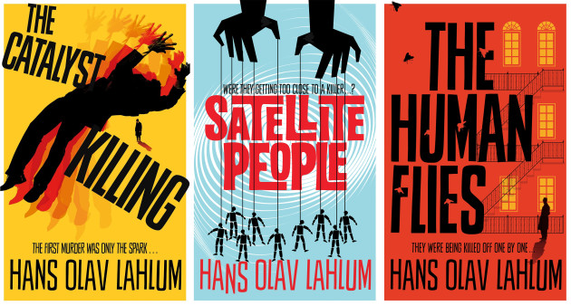
The cover of The Catalyst Killing, the third book in Hans Olav Lahlum’s series of murder-mysteries, appears to be a product of evolutionary homage that gets it right after two admirable-but-flawed efforts. Let’s start with the cover to the first book in the series, The Human Flies.

If the inspiration for this cover doesn’t immediately leap at you, perhaps it’s because it comes from a source that’s about as far removed from the mystery thriller genre as can be.

Saul Bass’s poster for West Side Story is an interesting–if unexpected–slice of art for a book cover homage to be based around, particularly a book with the tagline “They Were Being Killed Off One by One”. Comparing the book to the poster, however, the homage becomes fairly obvious. This puts the cover in an odd place, being an homage that’s too blatant, yet difficult to recognize. Besides that, however, the biggest issue with the cover to The Human Flies–which isn’t bad, by the way–is that it feels somewhat lifeless. It feels almost like something is missing, but not in an intriguing or mysterious way. It demands no questions, demands no attention. Again, not a bad cover, but it’s lacking.
The cover to the next book in the series, Satellite People, triples down on the homage, drawing from multiple Saul Bass works.


The puppeteer’s hands are lifted from The Man with the Golden Arm, the segmented doll-bodies are slightly reworked versions of the body from Anatomy of a Murder, and we get a white, spiraling background shape that references the Vertigo poster.
As a hodgepodge homage to Bass, it’s an admirable effort, but it strikes me as a little haphazard. The borrowed components don’t work that well together. The Vertigo spiral in particular is pointless. In Bass’s poster it conveys the disorientation suggested by the title. In the Satellite People cover it’s just background dressing. The twisted arm in the poster for The Man With the Golden Arm makes for a great visual complement to the ironic title of a movie about a man with a heroin addiction. The hands in the Satellite People cover aren’t good for much beyond looking familiar. The segmented body in Anatomy of a Murder‘s poster suggest a clinical, calculated approach to looking at a corpse, which again fits well with the title of the film and works within the theme of movie centered on a murder trial. Further segmenting the bodies for the cover of Satellite People helps emphasize the puppetry of the cover, which works well enough, but would have worked just as well if done in an art style that didn’t mirror Bass’s work. I know I’m repeating myself by saying the following, but this isn’t a bad cover. In fact, side-by-side with the cover to The Human Flies, my vision would be drawn to the cover of Satellite People. But given how many Saul Bass-inspired posters exist, created by professionals and amateurs, a grab-bag approach to appropriating his work comes off as unmotivated.
Fortunately, the cover for the third book in the series dials back the appropriation considerably, and is considerably better than its predecessors.

Every single damn thing about this cover is an improvement over the two that came prior. The homage is more subdued. None of Bass’s signature style is present in the primary image of the falling man. The lettering for the author’s name and tagline still mimic Bass’s text, but that’s all. When I first saw this poster it actually made me think of the Vertigo poster above, even though it bears no resemblance to it. I can only guess that the familiar font combined with the semi-spiral effect suggested by the echoing body pushed that thought to the front of my mind. The next thing I thought of was the classic 70’s paranoid thriller The Parallax View, but that poster only has a general idea in common with this cover.
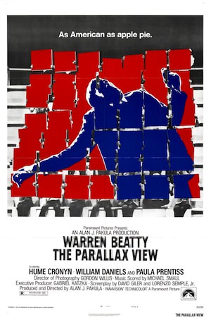
The still image of a man who’s been just struck (by an assassin’s bullet, it’s easy to presume) isn’t exactly uncommon, and the picture in The Catalyst Killing is more dramatic. Still, the 60’s- early-80’s conspiracy thriller vibe I was picking up from this cover was strong enough to make me look up posters for The Manchurian Candidate, The Conversation, Blowout and dozens more in that vein to see if there was a clear homage at work here. Maybe my research wasn’t duly diligent, but I couldn’t find one. This cover captures a fairly specific style without resorting to mimicry, so far as I’m aware.
Beyond that, I feel this cover is more dynamic, and captures hints of a story better than the preceding efforts. The staggered presentation of the title sells importance and urgency that’s worthy of the words. The tagline is perfect: it’s not as flat as “They Were Being Killed Off One by One,” but not as faux-dangerous sounding as “Were They Getting Too Close to a Killer,” which sounds more appropriate for a “gritty” new Scooby-Doo reboot. Sure, “The First Murder Was Only the Spark” might be viewed as somewhat redundant paired with the title, but I think it serves as a proper continuation of the title, and invites questions (specifically “Who gets murdered?” and “The spark for what?”) that add to my desire to read the book.
