
One of my favorites from the past few years is the first edition cover art to Stephen King’s novel Joyland. Created by the late Glen Orbik, it evokes the best of the artwork from pulp novels and magazines of decades past. In addition to the visual flair, what makes this cover effective is how it captures a micro-story of its own that sells a potential reader on how much more the novel contains.

The story shown on this cover is straightforward, but nonetheless intriguing. Here we see a young woman investigating an amusement park who appears to be frightened, looking up at someone with bad intentions. How do I know she’s investigating? Well, frankly, I don’t. Not for sure. For all I know the camera in her hand was just for sightseeing, not for sleuthing. But her facial expression, physical posture and position show us more than surprise and fear. She has the look of someone who’s been caught in the act. There’s no reason for her to back herself up against the fortune teller’s tent, unless she was already near it, using it as an obstacle to remain unseen.
For more “on-the-nose” evidence of what she’s up to, the type of camera she has is one of those old-school “I’m with the press” cameras. A different type of camera could have been painted, or the camera could have been left out, if there was no intent to depict her as a snoop.
Presenting her as an investigator in trouble gives the story of the cover details that would be absent if she was just your everyday distressed damsel in a thriller. The titular Joyland isn’t just a dangerous place, it’s a place that has something to hide, and whoever she’s looking at is one of the parties interested in helping Joyland keep its secrets, by whatever means necessary. Instead of being content to show a character in peril, this cover adds elements that suggest backstory and tickles your curiosity. Who is this woman? What did she see or notice before that prompted her to investigate the park? Who is menacing her, and what secret are they protecting? The cover teases a story that can compel interest in what the novel actually contains.
Contrast this with two alternate Joyland covers that are artistically fit, but altogether uninteresting.

Let’s start with the illustrated edition cover art, which was also painted by Orbik in his characteristic pulp-noir style. We have a near-naked woman holding a rifle, leaning against a rail, looking over her shoulder at the park in the distance. It’s pulpy, well-painted, and yet, compared to the first edition cover, it elicits indifference. Whereas the first edition cover presents a story and raises questions that suggest a mystery, the illustrated edition cover simply offers a character in pose and raises questions that suggest what you’re looking at is a little absurd. Why is this woman outside (on a deck presumably) barely covering herself with a towel? Why does she have that rifle? Why is she looking at the park with no particular emotion? Why should I care about any of this?
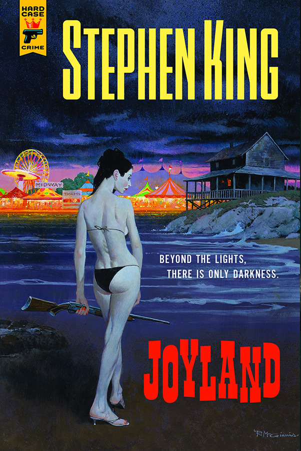
The same goes for the limited edition cover above, painted by another talented, prolific pulp artist, Robert McGinnis. Many of McGinnis’ paintings fit the description of “character(s) in a pose” as well, but he was also capable of capturing a small story or clear emotion when needed. For Joyland though, he basically gives us the same odd scene that’s found on the illustrated edition. Scantily clad woman holding a rifle near a body of water, amusement park in the distance. As art, it’s competent. As cover art, it’s uninteresting, especially in comparison to the original cover design.
Joyland is one of the relatively few Stephen King novels I haven’t read (though I have read the blurb), so I can’t say how relevant the near-nudity, rifle and house by the water are to the story, though I have to imagine the gun and the location–if, perhaps, not the cheesecake–have to play at least some part in what takes place. But even if those elements of the limited and illustrated editions are more relevant than anything shown in the first edition, the original cover is nonetheless more effective.
Beyond showing a more interesting story than the two other covers, the first edition feels more inspired. The red, orange and yellow lights behind our protagonist–but not too far behind her–make it look like the park is burning. The slight dutch angle of the painting adds to the sense of menace coming from the confrontation between the unseen threat and the discovered sleuth. The painting gives the viewer the perspective of the threat, and the tilt provides a sense of movement. There is action and urgency in this painting.
The motion and emotion of the first edition painting frees the tagline to be a fun imitation of a carnival barker’s taunting pitch. Conversely, the tagline of the limited edition–“Beyond the lights, there is only darkness”–is a sort of standard statement of foreboding that you can find on any number of horror or thriller novels. It’s not an ideal fit for a supernatural murder mystery set in an amusement park written by perhaps the most famous and successful horror author to ever live. McGinnis’s painting feels moody, chilly and lonely, but not especially dark, so the tagline doesn’t fit in that regard either.
Meanwhile the illustrated edition cover abandons a tagline in favor of promoting the book as a best-seller, with a pull-quote from the Washington Post, as if anyone needs a reminder that a Stephen King novel hit the New York Times bestseller list, or that it has been lauded by at least a few prominent reviewers.
In the end, the first edition cover is magnetic and alive. There’s nothing particularly wrong with a more static cover, and of course there will be people who prefer the limited edition or illustrated edition. To me, even as inoffensive as the alternate covers are, there’s no competition here. I wish more covers would seek the dynamism of the first edition to Joyland, not for the sake of making the books more appealing, but for the art of it.
